Goodblend
〰️
NETA Care
〰️
Surterra wellness
〰️
Parallel
〰️
Goodblend 〰️ NETA Care 〰️ Surterra wellness 〰️ Parallel 〰️
In two recent in-house projects, I focused on blending brand storytelling with the user journey to create engaging and effective e-commerce experiences. The first project was for Galileo, a specialty concentrates brand, where I worked to convey the brand’s unique identity through the website design. I ensured that every visual and interactive element reflected Galileo’s high-quality, niche offerings, creating a user experience that felt aligned with the brand’s values. By following e-commerce best practices—such as streamlined navigation and a responsive layout—I created a user-friendly page that made it easy for customers to explore the product range and complete their purchases, all while immersing themselves in the brand's narrative.
The second project was for a loyalty program that spanned two subsidiaries. This program had its own distinct brand identity, but it was essential to infuse the core principles of the parent brands into this sub-brand. My challenge here was to create a cohesive design that maintained the loyalty program’s unique branding while ensuring consistency with the overarching brand vision. At the same time, I had to prioritize the key KPI of loyalty acquisition, ensuring the design facilitated user engagement and sign-ups. By balancing these objectives, I developed a loyalty program site that resonated with users, fostered brand connection, and supported business goals.
In both projects, the combination of storytelling, user-centric design, and e-commerce best practices helped drive engagement, elevate brand identity, and achieve core business outcomes.
The loyalty redesign doubled the number of engaged sessions, with users spending twice as long on the page compared to the previous design, and increased signups by 10%. By integrating brand storytelling with a focus on key business goals, the new design drove stronger engagement and higher conversion rates.
COMING SOON NEW YORK
COMING SOON NEW YORK
Reimagining the shopping experience of
Coming Soon New York (CSNY)
The Mission:
My mission was to craft a shopping experience as distinctive as the store’s eclectic products, while enhancing user engagement and discovery. By enabling users to shop by style and artist, the design surfaces more relevant and inspiring items, quickly connecting customers with unique pieces that might otherwise go unnoticed. This approach not only streamlines the browsing process but also creates a personalized and immersive shopping journey tailored to individual tastes and aesthetics.
Overview:
For this project, I reimagined the e-commerce experience for "Coming Soon NY," a vibrant and eclectic decor store known for its unique and kitschy products. The goal was to create a shopping experience that reflects the store's artistic flair and unconventional spirit. Instead of following the traditional route of categorizing products by type or function, I designed a user interface that allows customers to explore items through more creative and engaging categories.
One of the key features of this design is the ability to shop by artist. Since many of the products at Coming Soon NY are created by beloved artists, this approach allows users to connect directly with the creators, making the shopping experience more personal and curated. Each artist has a dedicated page featuring their biography, artistic style, and a gallery of their products. This not only highlights the talent behind the products but also gives customers a deeper appreciation of the unique pieces they’re purchasing.
Additionally, I introduced a "Shop by Style" feature, which lets users browse items based on aesthetic themes such as "Retro Revival," "Pop Art Playfulness," or "Minimalist Chic." This method of categorization appeals to customers looking to create a cohesive look in their space or those who are simply drawn to a specific visual style. By breaking away from conventional categories, the design encourages users to discover products they might not have initially searched for, fostering a more exploratory and enjoyable shopping journey.
The overall design is playful and bold, with a color scheme and typography that reflects the kitschy and artistic nature of Coming Soon NY. The interface is intuitive, ensuring that even with these unique browsing options, the user experience remains seamless and user-friendly. This project showcases my ability to innovate within the UX design space, creating experiences that are not only functional but also aligned with the brand’s identity and the preferences of its target audience.
Process:
1) Aligning with the Brand’s Identity:
Goal: Reflect the eclectic, artistic nature of Coming Soon NY through the design.
Approach: Instead of traditional product categorization, I aimed to embody the store’s playful and creative spirit by offering unconventional shopping categories like "Shop by Artist" and "Shop by Style." This approach reinforces the brand’s focus on uniqueness and individuality, giving users a more personal connection to the products and their creators.
2) Enhancing Product Discovery:
Goal: Create a system that surfaces more products in a way that feels intuitive and engaging.
Approach: I focused on breaking away from the limitations of traditional categories (like "furniture" or "decor") to give users a more exploratory experience. By allowing them to filter by style, room, or artist, the design encourages users to discover products they might not have thought to search for. This increases the likelihood of users finding items that resonate with their personal aesthetic, resulting in a more meaningful shopping experience.
3) Fostering a Connection Between User and Product:
Goal: Make the shopping experience more personal and immersive.
Approach: The "Shop by Artist" feature allows customers to connect with the story and personality behind the products. Each artist’s page showcases their creative journey, along with their unique pieces, giving users a deeper appreciation of the design process and a closer bond to the product they’re buying.
4) Designing for User Engagement:
Goal: Engage users by making the interface not just functional but also visually and emotionally engaging.
Approach: The design incorporates bold colors, playful typography, and intuitive navigation, aligning with the store’s kitschy aesthetic. This creates an enjoyable and visually stimulating environment that invites users to spend more time browsing. The intention is to make the shopping process feel more like an adventure than a task, keeping users engaged longer and encouraging them to explore the full range of products.
5) Streamlining the Shopping Experience:
Goal: Ensure the experience remains efficient and user-friendly despite the unconventional structure.
Approach: While embracing creativity, I made sure to prioritize ease of use, ensuring that the navigation remains simple and intuitive. The categorization by style and artist was designed to help users quickly filter through products without feeling overwhelmed, providing clear paths to relevant items based on their aesthetic preferences.
GROW
GROW
Grow is the app for plant people to connect, learn, and sell.
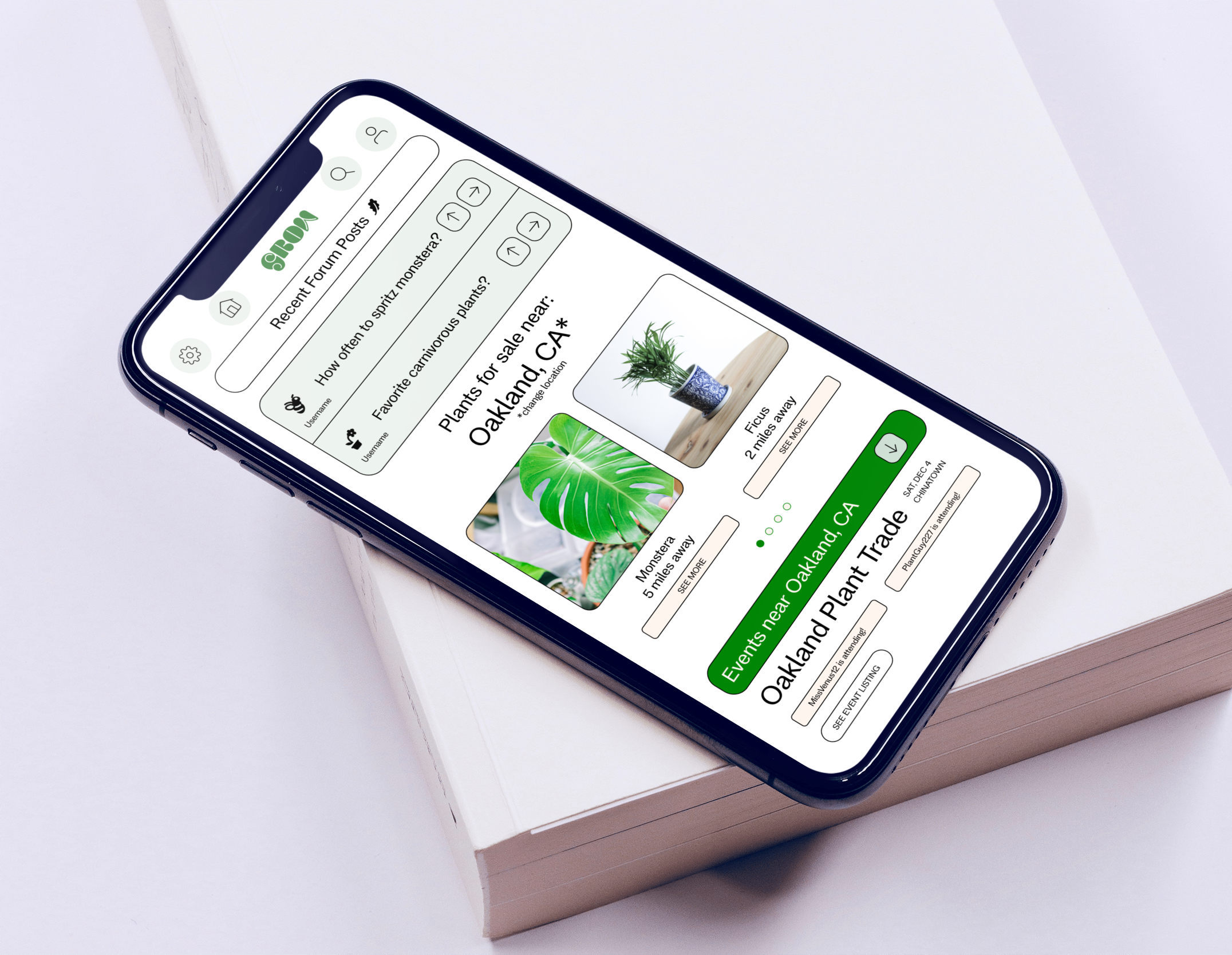
The "Grow" app is a community-driven platform designed for the ever-expanding community of plant enthusiasts, particularly targeting Millennials and Gen Z who have embraced plants as a key part of their lifestyle. This app is a response to the increasing trend of young people dedicating time, money, and energy to cultivating their love for plants, both as a hobby and a form of self-expression.
"Grow" offers a multi-faceted experience tailored to the needs of modern plant lovers. One of its core features is a vibrant marketplace where users can buy, sell, and trade plants, seeds, and related accessories. This peer-to-peer exchange encourages sustainability and fosters a sense of community by allowing users to connect over their shared passion for plant care. The marketplace is designed to be easy to navigate, with detailed listings and filtering options that help users find exactly what they’re looking for, whether it’s a rare monstera or a simple succulent.
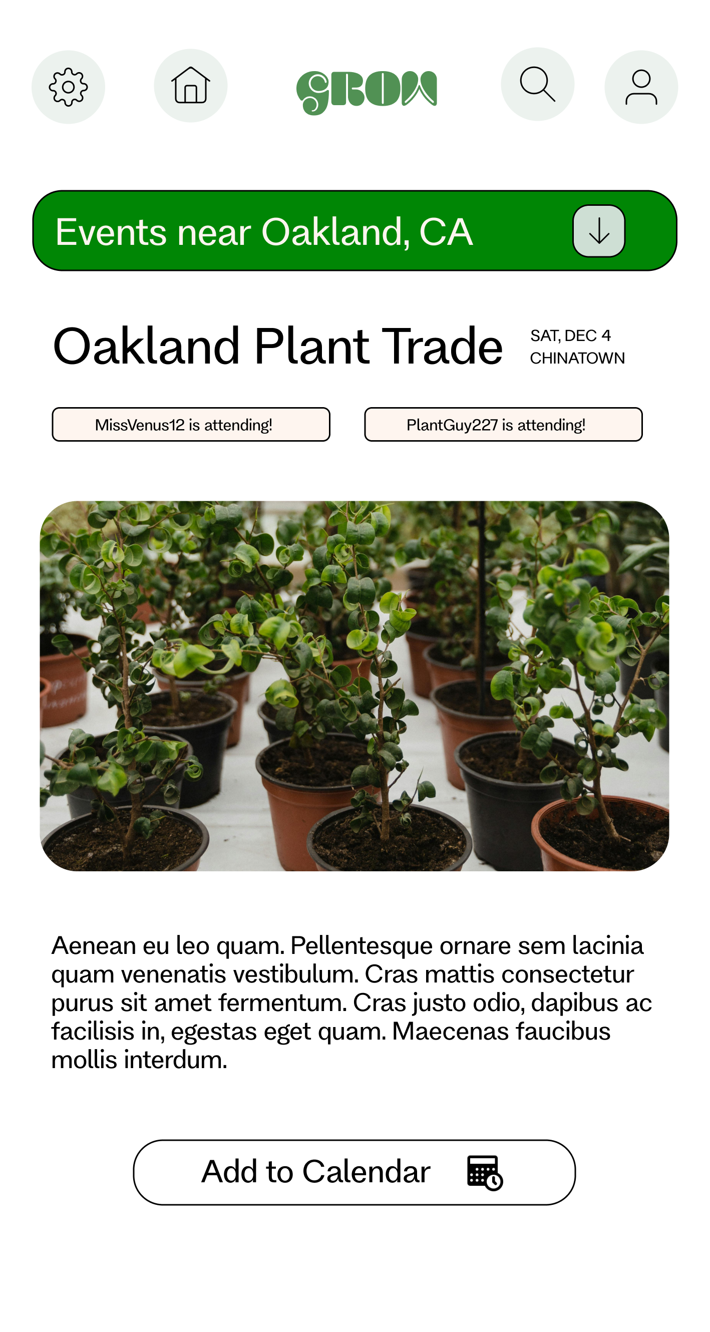
Beyond the marketplace, "Grow" serves as an interactive hub for plant-related activities and knowledge-sharing. Users can discover and attend local or virtual events, such as plant swaps, workshops, and gardening classes, all within the app. This feature supports the social aspect of the plant community, helping users build connections with others who share their interests. Additionally, the app includes a forum where users can ask questions, share tips, and showcase their plant propagations. This space is designed to be welcoming and supportive, catering to both seasoned plant parents and those just starting their green journey.
The design of "Grow" reflects the natural and calming aesthetic associated with plant care. Soft greens, earthy tones, and organic shapes are used throughout the interface, creating an environment that feels both inviting and serene. The user experience is seamless and intuitive, ensuring that users can easily navigate between the marketplace, events, and community features. "Grow" embodies the idea that plant care is more than just a hobby; it’s a lifestyle that brings people together, fostering growth not just in plants, but in relationships and knowledge as well.
Process:
1) Understanding the Target Audience:
Goal: Cater to the growing community of plant enthusiasts, especially Millennials and Gen Z.
Approach: I focused on creating a design that resonates with a younger demographic that views plant care as more than a hobby, but as a lifestyle and social activity. This insight guided the development of features like the marketplace, events section, and community forum, where users can engage with others who share their passion for plants, fostering a sense of belonging.
2) Facilitating Community Interaction:
Goal: Create a space where users can easily connect, share knowledge, and engage in plant-related activities.
Approach: The app's design integrates community-driven elements like the Q&A forum and the plant propagation sharing feature, promoting collaboration and interaction among users. These features encourage knowledge-sharing and make the app a hub for people to ask questions, share successes, and seek advice, positioning "Grow" as not just a tool, but a community.
3) Supporting Sustainability and Plant Swaps:
Goal: Encourage sustainable practices and facilitate plant trading.
Approach: The buy/sell/trade marketplace was designed to make it easy for users to find, sell, or trade plants within their local community. This feature supports sustainable plant care, allowing users to recycle and reuse plants and materials, while also reducing the environmental impact of purchasing new plants. It also fosters connections between users, allowing them to build relationships through shared exchanges.
4) Simplifying Event Discovery and Participation:
Goal: Help users find and participate in local and virtual plant-related events.
Approach: The "Events" section was designed to integrate seamlessly into the user experience, making it simple to discover workshops, plant swaps, and community gatherings. I focused on an easy-to-navigate event calendar and location-based filtering to ensure users can quickly find events that suit their interests and location, further enhancing community involvement.
5) Creating an Intuitive, Calming User Interface:
Goal: Design an interface that is both easy to use and aesthetically aligned with the plant-loving community.
Approach: The app’s visual design uses soft, natural tones and organic shapes to create a calming and visually pleasing environment, reflecting the soothing nature of plant care. The interface was designed with intuitive navigation in mind, ensuring users can easily move between sections like the marketplace, events, and forum without feeling overwhelmed.
6) Promoting Knowledge and Growth:
Goal: Encourage personal growth in plant care through easy access to information and resources.
Approach: Features like the Q&A section and plant care tips were designed to support users at every level of their plant journey, from beginners to experienced plant parents. By integrating educational resources and community support, "Grow" helps users improve their plant care knowledge and skills, reinforcing the app's mission of growth—not just for plants, but for the users themselves.


